|
Coloring Panels - Tutorial
This is by no means "the" way to color... It's just the way I do it. I
really don't expect people to follow this to the bill, in fact, I'd be
disappointed if they did. I don't want to start Sly's school of color,
or anything. Heck, I don't even color this way all the time.
Everyone must find their own ART. That said, I hope you find some
useful tricks in here. This is where I'm at after four years of playing
with photoshop. I intend to improve and learn new tricks with time, and
so should you.
Now that that triteness is out of the way, I use Photoshop 5.5,
so if you use a different version, your tools will be slightly (or
vastly) different.
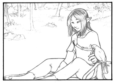 Step one: Scan your image and adjust the
contrast and levels. Every scanner is different, so adjust to your
tastes. There are seven panels on page 14, but we'll be doing this
panel in particular for the tutorial. I never do the panels in a
particular order, but I always do one at a time. Step one: Scan your image and adjust the
contrast and levels. Every scanner is different, so adjust to your
tastes. There are seven panels on page 14, but we'll be doing this
panel in particular for the tutorial. I never do the panels in a
particular order, but I always do one at a time.
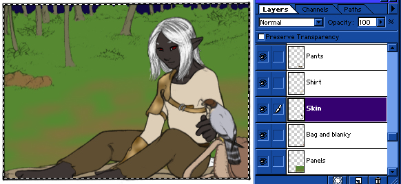
Now that you have a scan, give yourself another layer, underneath your
scanned image. I always make that white, but it's up to you, really.
Now, as seen below, while having the lineart selected, click on
"Channels" on the layer tool.
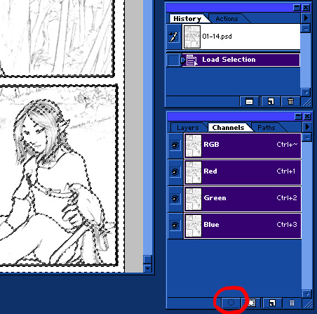 From here, you can "load the selection,"
using the round dotted tool that I circled there. This, as you can see,
will select all the white in this image, provided you have a grayscale
image. If you don't it'll select weird things. From here, you can "load the selection,"
using the round dotted tool that I circled there. This, as you can see,
will select all the white in this image, provided you have a grayscale
image. If you don't it'll select weird things.
Once you've selected, hit the "delete" button. That'll make all the
white go away. Deselect the selection (using the marqee or lasso tool,
or even right click: deselect). You'll notice that your lines have
gotten thin and dinky. No problem.
As seen below, go back to "Layers." In 5.5 the "Preserve Transparancy"
option is right there. I know they've moved it in later versions, so
ask your Help where it is if you don't know. Now that your transparency
is preserved, grab a
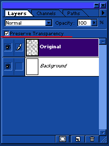 nice, big paintbrush at 100% opacity, and
color over all your lines with it. Viola, they're back to the way they
were, right? Good. nice, big paintbrush at 100% opacity, and
color over all your lines with it. Viola, they're back to the way they
were, right? Good.
Now it's time for the flatcolor. Various artists have various ways of
preserving their color consistency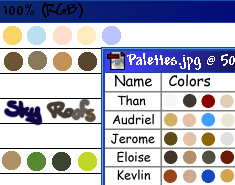 , ,
but I use little pallete images. I have character pallettes and scene
pallettes, and I just pick them up with the eyedropper tool as I need
them.
Okay! Now you're going to need a lot of layers between the Background
and Lineart layers. It
doesn't really matter how you do it, so long as background and
character are on separate layers and so long as you break the character
colors up so that they don't overlap. There's a definite exception to
the latter rule, but we'll get to it in a minute. The thing you need to
note with flatcoloring is where the color meets the lines. I make sure
the colors overlap beneath each other (so that there are no spaces) and
that they're underneath the lines as well. Since I use pencil art, the
lines are gray, and pick up the color beneath them. If you want this
same effect for ink art, you'll either have to lower the line opacity,
or color the lines as well.
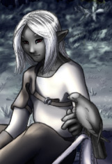
 As you can see here, Than's raw leather and
Bashirah's markings are on one layer. We'll get back to that. You may
also noticed that I've added some lines and details that I missed when
I originally drew it. This happens a lot, and little mistakes are
easily fixed in photoshop. As for the forested background, it is also
on one layer. I like to paint the forests altogether, as it's grown up
together. And now I show you how. There are two main lightsources in
this panel: the full moon and the camp fire. The main light source is
the moon, so we will do our preliminary shading that way. Which is to
say, we'll shade as if we were shading full sunlight. There are two
major differences between sunlit scenes and moonlit scenes. The first
is this: in the sun, things in the distance get lighter, in the moon,
things in the distance get darker. Bearing this in mind, we'll start
adding shadows to the background. I do the background first because I
find it easier to fit the character to the background than the
background to the character. As you can see here, Than's raw leather and
Bashirah's markings are on one layer. We'll get back to that. You may
also noticed that I've added some lines and details that I missed when
I originally drew it. This happens a lot, and little mistakes are
easily fixed in photoshop. As for the forested background, it is also
on one layer. I like to paint the forests altogether, as it's grown up
together. And now I show you how. There are two main lightsources in
this panel: the full moon and the camp fire. The main light source is
the moon, so we will do our preliminary shading that way. Which is to
say, we'll shade as if we were shading full sunlight. There are two
major differences between sunlit scenes and moonlit scenes. The first
is this: in the sun, things in the distance get lighter, in the moon,
things in the distance get darker. Bearing this in mind, we'll start
adding shadows to the background. I do the background first because I
find it easier to fit the character to the background than the
background to the character.
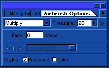
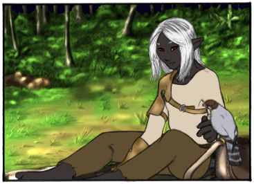
For this kind of scene, shadows are accomplished with two tools:
Airbrush and Burn, at the settings shown to the right. We will get into
the artistry of the dodge and burn tools in a bit. For now, lets see
what we can do with the airbrush. With a green airbrush on mulitply,
I've done this: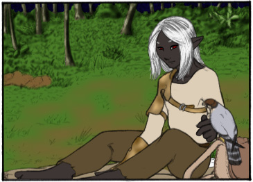
I've done two other things as well. I've put in some highlights with a
pale brown airbrush set at "screen." The other thing I did, because the
colors I started with were too light, was darken the entire layer via
"Variations," which I will go into further detail further on.
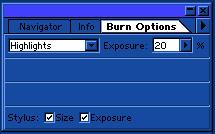
But now it's time to touch on the beauty of dodge and burn.
Traditionally, the digital artiste scoffs at these tools, saying only
lazy novices use it. I'd venture to say that this is because neither
they, nor the novices, understand what the tool actually does. It, at
first glance, looks like an easy way to add highlights and
lowlights to flatcolor. Well, that is exactly what it is, so
long as you understand that the tool also affects the
saturation of the color. And so, if you use the burn tool at the
default setting only, that being Midtones at 50% exposure, you will
find that your shadowy areas are heavily saturated. That's no good,
right? Shadows aren't heavily saturated! That's why you also
use the
burn tool at the Highlights setting and the sponge tool at the
Desaturate setting. I encourage you to play with the exposure
percentages and settings for each of these tools to get a feel for them
and what they do. Because when you do, you can make it look something
like this:
This is pretty quick and dirty, but that's the look I'm going for for
this panel. For more control over your color selection, I direct you to
the paint- and airbrush tools. Remember the blending setting called
"multiply"? There are also "dodge" and "burn" settings there. Again,
play around with them to get a feel for what they do. CTL-Z is your
best friend.
Now then, I said there were two differences between sunlight and
moonlight? It's time for the second one. Saturation. Moonlight doesn't
have much color it in, and the ambient light from the sky makes things
seem blue, right?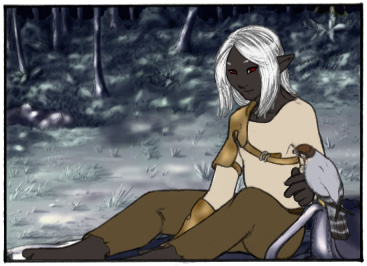 Something more like this, right? Something more like this, right?
Easily attained.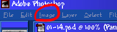 Here we see "Image" up at the top of the
window, yes? Here we see "Image" up at the top of the
window, yes?
From Image, go to Adjust, and from Adjust, we go to Variations. From
here, you can do many lovely little alterations. Here, I merely
desaturated, but as you can see, lots of evil little short-cuts abound
here. Then I duplicated the layer and I took my moonlight color
(#BAC4FF, but you can make any variation you want) and with Paintbrush,
100% opacity, Color, go over it.
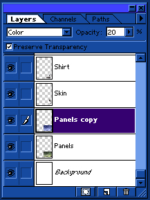
Here, I show how the layer blending looks in the layer window. It says
20% opacity, but I actually used 40%. I use 20% when I do the
characters though! Which is what we do now. Dodge and burn, without
much caution, because I simply desaturate it with the sponge tool at
30% and add the blue. Wait! I said there was a trick, didn't I? Well, I
guess it's time to let the cat out of the bag... The secret
is...#808080.
I am entirely serious, here. I do the shading in grayscale. For skin,
patterns, anything that's supposed to be smooth, and often the entire
character for drawn-back shots, I copy the color layer and make a gray
duplicate. Then using the dodge-midtone and the burn-highlight tools, I
create a grayscale shaded version. What I do after that is so cheatery
I really shouldn't call myself an artist...
 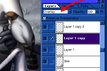 Once you're done shading, copy
the gray layer. Change the
blending on the first one to Overlay, and the second one to Multiply.
Run the Multiply layer through
variations and lighten the highlight a fair bit. Then, adjust the
opacities as
necessary. Flatten, and do the saturation/color adjustments to match
the rest, and you're almost done. Once you're done shading, copy
the gray layer. Change the
blending on the first one to Overlay, and the second one to Multiply.
Run the Multiply layer through
variations and lighten the highlight a fair bit. Then, adjust the
opacities as
necessary. Flatten, and do the saturation/color adjustments to match
the rest, and you're almost done.
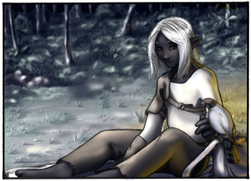 The last step is the firelight. Simply take a
golden yellow airbrush with screen or hard light at the blend, and have
fun lightening things. Bear in mind to keep the fire-high-lights within
the boundary of the shadows, otherwise it'll look over-exposed and
bleh. The last step is the firelight. Simply take a
golden yellow airbrush with screen or hard light at the blend, and have
fun lightening things. Bear in mind to keep the fire-high-lights within
the boundary of the shadows, otherwise it'll look over-exposed and
bleh.
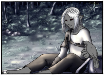
And...the you're done. Wow. Coloring takes forever when you're stopping
to take pictures of your progression the whole way through. Wow.
|
|
|
|